Muzeum Narodowe w Kielcach
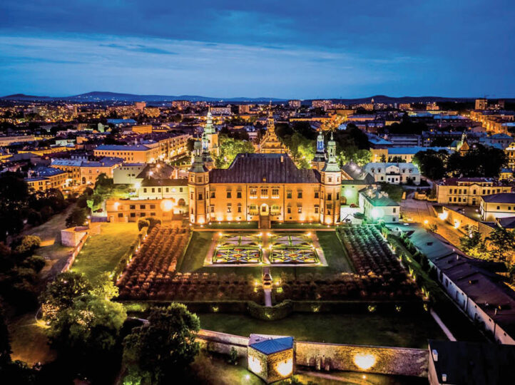
Redesign logo Muzeum Narodowego w Kielcach (MNKi) z 2018 roku, mojego autorstwa, wyrasta bezpośrednio z architektury głównej siedziby Muzeum – Pałacu Biskupów Krakowskich. Barokowa bryła obiektu, bogata w podcienia, krzywizny i łuki, stała się formalnym punktem wyjścia do zaprojektowania znaku, który jednocześnie funkcjonuje jako skrót nazwy MNKi. Logotyp oparto na czystych, geometrycznych kształtach: litery przenikają się, zachowując czytelność, a zarazem tworząc wrażenie przestrzenności i „architektonicznego” rytmu. Zastosowany granat podkreśla stałe wartości instytucji – równowagę, tradycję i powagę – ale równocześnie niesie skojarzenia z rozwojem, kreatywnością i nowoczesnością. Całość dopełnia nowoczesna typografia w postaci minuskuły, która celowo „zbliża” Muzeum do odbiorcy, wspierając wizerunek instytucji otwartej na współczesne, mniej formalne formy komunikacji.
The 2018 redesign of the National Museum in Kielce (MNKi) logo, authored by me, is rooted in the architecture of the museum’s main seat—the Palace of the Kraków Bishops. The building’s Baroque massing, rich in arcades, curves, and arches, became the formal starting point for a mark that also works as a compact MNKi abbreviation. The logotype is constructed from clean geometric shapes: its letterforms interpenetrate, remaining legible while creating a sense of spatial rhythm inspired by architectural structure. The chosen navy blue emphasizes the institution’s enduring values – balance, tradition, and – authority while also suggesting growth, creativity, and modernity. The system is reinforced by a contemporary lowercase wordmark, intentionally bringing the museum closer to its audience and supporting an identity that remains open to current, creative, and less formal modes of communication.